
Thursday, 9 December 2010
Trish Morrissey
Yesterday I gave a presentation on photographer Trish Morrissey and decided to quickly add her to my blog so that I remeber her before the due date!
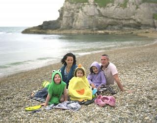
I mentioned two products produced by Morrissey, the first being 'Seven Years'. The name represents the age gap between her and her sister. In the images Morrissey and her sister reconstruct a family album to which most of us can relate. The pictures are very generic and she made sure all the clothes and props reflected the eighties period which allows us to again look back and relate to our own family album's which were created in the past. There is nothing special about the actual images however it is the concept behind them which struck me. Below I have published some of the images from the 'Seven Years' project.


I mentioned two products produced by Morrissey, the first being 'Seven Years'. The name represents the age gap between her and her sister. In the images Morrissey and her sister reconstruct a family album to which most of us can relate. The pictures are very generic and she made sure all the clothes and props reflected the eighties period which allows us to again look back and relate to our own family album's which were created in the past. There is nothing special about the actual images however it is the concept behind them which struck me. Below I have published some of the images from the 'Seven Years' project.


I find the images somewhat demeening to the family album in one respect because of how so many people can relate to the constructed images and how fake they all must be as we all pose infront of the camera. In a lot of th eimages however, unlike in most family albums Morrissey and her sister are not smiling and that is to concentrate on their body language and recognise the tension within the relationship on display.
The other project was called 'Front'. Through this project Morrissey went to beaches and spoke to families asking to take the place of a female within their unit. In most cases the mother figure. She would also ask to wear her clothing and pose with the family as if she were them. I found this whole concept intriguing, she is observing beaches, relationships and identity.


Tuesday, 7 December 2010
Silly Experimenting with Adobe Photoshop CS4

ORIGINAL


GRAIN: 4, HIGHLIGHT AREA: 0, INTENSITY: 10.
COLOR HALFTONE. Set MAX RADIUS: 4
Set the BLENDING MODE to DARKEN.
STROKE LAYER STYLE of WIDTH: 20px, POSITION: Inside and COLOR: #F5ECE1.

Not convinced with this image, it didnt quite work out but I've added it anyways as one of my failures, because this is all just for playful experimentation.

ORIGINAL

Added NOISE and DUST AND SPECLES
Reduced SATURATION to Black and White.
Meant to have the look of an old film.

ORIGINAL

Filtered image to NOTE PAPER

Cropped Image

SATURATION to the Max, HUE of choice

I think the final image turned out quite fun, I like it.

ORIGINAL

Played around with the LENS CORRECTION

Kind of like how it has put trish more in focus and the slight contortion to the shape of the image.

ORIGINAL


Added CUTOUT filter.

ORIGINAL

Shallow Grave
We were asked to watch a few movies and choose one we wished to produce work which would show a reflection on the film. The film I chose was Shallow Grave. The concept of the film is quite interesting although the acting skill is lacking somewhat in my opinion, which is irrelevant anyways; moving on. I initially was interesting in the angles at which the directer often chose to shoot at. Furthermore I developed some shots of trying to take photography of my subjects at weird angles. I wasn't really impressed with anything i was doing that is when i realised i was focusing too much on the angle and too little on the subject. So I turned everything around and started focusing a lot more on subject. Through out a lot of the film I feel as though the viewer is made to feel uncomfertable. We are faced with twists and turns leaving our minds filled with uncertainty. We observe the friendship of three people as it falls apart for the sake of greed. Hwoever through out the film I questioned the victims. We are faced with Alex, Juliet and David. Initially David is totally against the idea, then pressured into it by Alex, and because he pulled the short straw (literally) he had to cut up the body. This lead him to turmoil into madness, obviously, yet he is depicted as a bad man, we do catch him spying and being violent and threatening however. Alex, seems like a happy guy didnt want trouble just the money and to have a good time, but thinking of how forceful he was on the matter I question wether he brought this on himself and if so does that make him less of a victim? Juliet, possibly the most deceivng of them al. Using her femal charm on David who she knew had feelings for him how convenient even involving herself in the violent fight at the end of the film in desperation for the money, hammering down a knife into her 'friend' to keep him pinned to the ground while she escapes. However she too a victim feared by Alex and his possible capabilities.
This is where the change of mind came through, I really liked the concept of questioning the victim and wanted to produce images in which one questions whether their subject is or is not infact the victim.

This is the image I produced of Simon. What I like about the image is the expression on his face as it is pressed against the glass. Seeing somone pressed against glass with a look of distress would initially fire the thought that we are looking at a victim, however if you look at his hand, he is holding a hand saw; a weapon. Could this be a weapon being used in self defence or have we been presented with the attacker perhaps amidst an attack?
Bowl Light and Canon 5D Mark 1

Above a lovely portrait of myself. I smeared my make up, put baby oil on my face to imitate tears, ruffled my hair and all this together with some acting that shits on Kerry Fox's (Juliet in Shallow Grave), we have an image of distress. I used myself for this image, because I wanted the face of a woman. Furthermore when we see a woman distressed in most cases we defend the female. When you watch Shallow Grave however Juliet is no less violent and morbid then Alex and David, on the other hand she is perhaps darker in some respects. Moreover ones initial response is to see a man's hand forceful on a woman and a asume the worse on her behalf, however an image is a moment in time, we do not know the before or after. Should we not consider the idea that perhaps the subject is not the victim? perhaps she is being pushed away rather then raped. That is what I want from my viewers, to think of different responses to the images rather then to their initial thought.
The reason why I chose this image is because I like how the lighting came through and angle. I took several images to be able to have a lot to choose from, just snapping away with my arm stretched out while I moved around and got pushed around.
Bowl Light and Canon 5d Mark 1

Finally an image of a male peering through blinds. Again, I showed this to a few people in request of their response. In most cases we are looking at a pervert, a creepy Peeping Tom. However might he not be frightened in his home? hearing sounds from outside? Very plausable. Something I also find charming is how peering through blinds is recognised as perverse, yet I'm pretty sure if not everyone, then almost everyones either peered through curtains or blinds, or just watched someone knowing they don't know at some point.
Soft Box and Canon 5D Mark 1
In conclusion, just like when watching Shallow Grave, my images have been produced to question our subject. Obviously we are unable to come to any conclusions as we are unaware of any time or happenings surrounding the actions captured. However we should not jump to conclusions rather we should develop them. And finalyl, the images should leave the viewer feeling uncomfertable, uncomfertable by the situation and uncomfertable by not knowing whats going on and whether to feel sorry for the individual or not as I did in the film.
This is where the change of mind came through, I really liked the concept of questioning the victim and wanted to produce images in which one questions whether their subject is or is not infact the victim.

This is the image I produced of Simon. What I like about the image is the expression on his face as it is pressed against the glass. Seeing somone pressed against glass with a look of distress would initially fire the thought that we are looking at a victim, however if you look at his hand, he is holding a hand saw; a weapon. Could this be a weapon being used in self defence or have we been presented with the attacker perhaps amidst an attack?
Bowl Light and Canon 5D Mark 1

The reason why I chose this image is because I like how the lighting came through and angle. I took several images to be able to have a lot to choose from, just snapping away with my arm stretched out while I moved around and got pushed around.
Bowl Light and Canon 5d Mark 1

Soft Box and Canon 5D Mark 1
In conclusion, just like when watching Shallow Grave, my images have been produced to question our subject. Obviously we are unable to come to any conclusions as we are unaware of any time or happenings surrounding the actions captured. However we should not jump to conclusions rather we should develop them. And finalyl, the images should leave the viewer feeling uncomfertable, uncomfertable by the situation and uncomfertable by not knowing whats going on and whether to feel sorry for the individual or not as I did in the film.
Ring Flash and Medium Format with Digital Back
As I have already mentioned we were shown how to use the Ring Flash last week and I took a couple pictures. The image below is of Simon and I took it using the Ring flash and a Medium Format Camera with a digital back, which is amazing. The photographs were immediatly transferred onto Capture One, which is a programm I really need to learn more about. I made a point of using is last Thursday to get a bit more used to it and confident with it. I understand the basics of the program like starting a new session, correcting the white balance, creating a 'thread' so that each photograph follows through with the same qualities proposed. However I am not fully aware of the potential of the program and understand that a lot of proffessional photographers are using Capture One and I really need to get cracking and become completly used to the program first however I want to look into what exactly its about and does, then I will experiment because I will know what I can experiment with.

I took the image of Simon using the ring flash and the medium format camera with a digital back which is amazing, the detail on this image alone is impeccable. Simon had to be sat down for this shot becasue of his height, I stood close to him and took it from above pointing downwards. I used a large aperature for a shallow depth of feild which is really apparent in this photograph. You can see how clear his face is and how the focus drops as the words on his t-shirt become blurry, there is even less focus on his ears. I'm actually really pleased with this portrait and I am really excited about using the ring flash again this Friday in the studio hoping to get some interesting and fun shots.

The picture above was taken of me by simon. I like the way he's cropped the image I think its very neat and concise. In regards to the expression on my face, I wasn't meant to look that miserable; it's just my face.
Friday, 3 December 2010
Nan Goldin
A selection of images Nan Goldin has taken reflecting the personal, private and intimate side of people close to her and herself.


Blog Presentation Feedback
Last week I presented my blog in class. After my presentation Ines discussed with me how she felt there was a lack of coherence within my blog. My images seem to be all over the place. This is clearly evident to anyone who even skims through my blog and I think my lack of certainty has really come through. However I realise that the work on this blog is meant to develop into a project for next semester.
On the other hand throughout this project I have come to realise that I really enjoy using the outdoor lighting kit. I like results of using the lighting and I like that the photographs aren’t taken in the studio, rather the images have the ability to become more personal because I can take them anywhere. On a positive note, Ines recognised my interest in taking photographs of people I know well and feel close to. She suggested I look into the image of photographer Nan Golden who too enjoyed photographing people she felt close to, in fact as far as I know she only photographed people she knew. This has lead me to think about my second semester project of possibly creating a short book that relates to someone close to me and to take personal images of them in their space. Something Ines also pointed out which I found interesting was my interest in the colour red. This may be due to my past studies which were related to art. There is something so grasping about the colour red that I do enjoy using it within my imagery, because I feel it draws the eye, which infact I speak about in one of my posts. This observation from Ines has sparked in interest in me, because although I knew I found myself drawn to the colour I hadn't realised it, if that makes much sense and I feel as though her comment will not go overlooked, rather I plan on producing work which I find Ines found consistency in because that is obviously where my interest must lay.
In conclusion I appreciate Ines’s feedback and I think it may have helped me narrow down my aims for next semester a great deal.
In conclusion I appreciate Ines’s feedback and I think it may have helped me narrow down my aims for next semester a great deal.
Thursday, 2 December 2010
Media
I have been meaning to add this photograph to my blog for a while now. I took this image for the Liverpool Biennial project in which we were asked to take an image which reflects contemporary art in some form and was influence by the different shows in some aspect. There were a lot of political messages in many of the exhibits and therefore I decided I wanted to produce a piece which puts a message across. The photograph I took as been posted below. The literal message not to eat everything the media tells you. The idea of this picture is to express how most things delivered by the media need to be taken with a pinch of salt (pun intended).


I was quite please with this image, however what i dont like about it is how dark it is on the right hand side. I liked the shadow which developed round the bottom of the plate on the right, however I think it would have been a more interesting image had I added some light to the light and put it on a lower power setting, to keep it darker however to fill it with a bit of light.
Another thing I am not sure of is weather the image is clear enough on its own and if the messge comes across without having to literally tell the viewer and I hope so, because I very often prefer art pieces untitled.
Ring Flash
Today we got inducted on Ring Flash which I've been wanting to use for a while now because I had liked results I had seen on pictures in first year. Initially Adam explained how ring flash creates a glow like shadow along the subject. I placed picture below of actress Jennifer Aniston because I thought it displayed this glow perfectly.

He also explained that because the flash is merely creating an even light across the subject it isn't actually creating anything exciting or dramatic unless you make it. So how you position and capture your subject is a vital part of creating an interesting portrait using the ring flash. The following are a few portraits which have been taken using the Ring Flash which I found interesting.


He also explained that because the flash is merely creating an even light across the subject it isn't actually creating anything exciting or dramatic unless you make it. So how you position and capture your subject is a vital part of creating an interesting portrait using the ring flash. The following are a few portraits which have been taken using the Ring Flash which I found interesting.


In the above case Ring Flash was combined with a long exposure to capture the ambient light from behind the glass. The camera was given a twist at the time of exposure to record the background as a series of streaks.
I really like the ring flash and have booked it out for a session in the studio next friday in aim of getting some practise.
Coloured Gel Photography
These are some more images I have found which use coloured gels. These images have been taken in a more interesting way to the previous post which was mainly to recognise the technical aspect.


Using just a grey paper background roll, portable Broncolor Mobil flash lighting kit and some coloured gels.

coloured gel to provide the colour, a near infinite variation of saturation, hue and luminance is available. I used turquoise and lavender gels together to create this shade.

Long exposure in the dark - subject lit up by small torch with different coloured gels.


Using a Lomo Camera, the photographer takes an initial photograph then without winding the camera takes other photos to create an overlapping effect. For this image there has been an inclusion of gles which I think creates an interesting result.

I like the grainyness to this image and the composition of the image. The shut eyes and pose of the woman in the background, the eyes looking directly towards the camera in the foreground together with the purply/punk colours which are relying more on red then blue are creating a sexual connotation to the image.
Subscribe to:
Posts (Atom)